Jurosh_ Software Developer
by Juraj

Modern CSS - so many layout choices
Epic fight between table vs flex vs grid vs float!
Web is great! We have many options to build layout and position our elements. But sometimes it's quite hard to navigate and pick correct approach.
To position elements there are following ways:
inline-blockandtext-align- tables (css emulation with
table-row,table-cell) - blocks and floating (
left,right) - flex (flexbox)
- grid
How to choose right one?
Css Grid
Latest technique of creating layout. Easy to learn and understand basic concepts.
Good compatibility with latest browsers.
How to use Grid ?
Want more columns of some minimal width? No problem, just type:
.listing {
  display: grid
  grid-template-columns: repeat(auto-fit, minmax(200px, 1fr));
  grid-gap: 20px;
}
In flex, there is one really clever unit and it's fr (fraction). In one grid row we may put as many fractions as we want and all these fractions are trying to take full available width of row. Eg. 1fr 2fr 1fr will create 3 columns, first taking 25%, second 50% and third 25% space of row width.
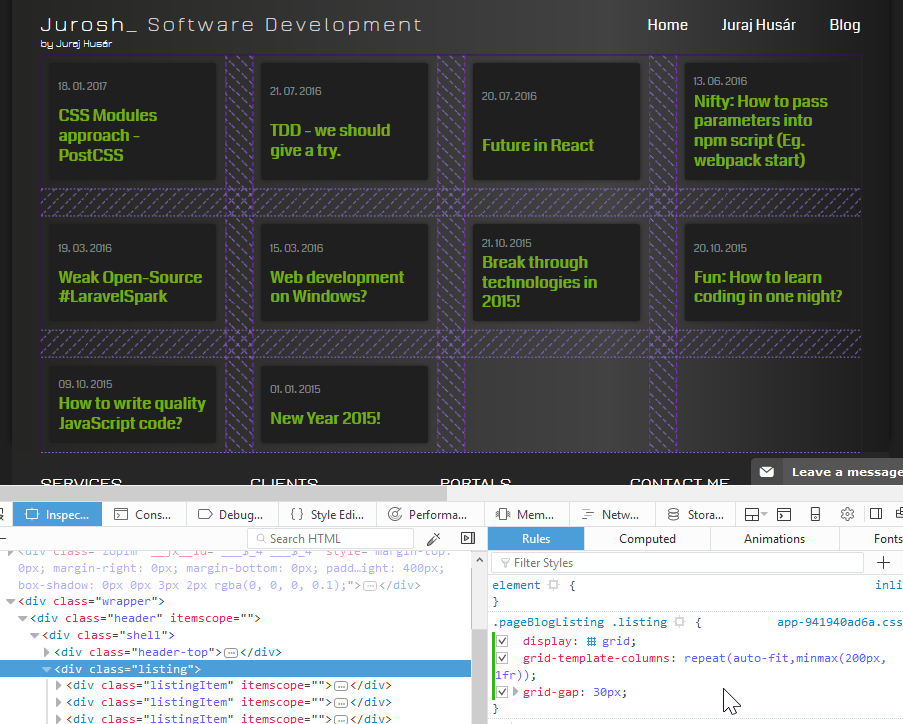
You may try this on my blog (just change display:flex to grid):

Code above will create grid of columns with at least 200px and fit them as many to columns as is possible. And everything without any media query.
Simpler alternative of using grid would be creation of fixed count of columns like:
.listing {
  display: grid
  grid-template-columns: 1fr 1fr;
  grid-gap: 20px;
}
There are some links which helped me to learn grid:
- https://developer.mozilla.org/en-US/docs/Web/CSS/CSS_Grid_Layout
- Grid by examples: gridbyexample.com
- Really cool game to get familiar with css grid: cssgridgarden.com
Flex, or Flexbox
Relatively new technique, but already supported in all modern browsers (also partially in IE11).
It's quite harder to understand (like grid, or floating) but is really powerful. It's called flex because we are talking of layout flexible in many ways - flex supports horizontal and vertical aligning, ordering of elements, and more advanced and useful features.
We may try to reproduce example similar like we did for grid:
.listing {
  display: flex;
  flex-wrap: wrap;
}
.item {
  flex: 200px;
  margin: 20px;
}
For this example we need a little more code. Best usage for flex is for single row, so that we need to turn on wrapping, because we want to achieve more rows positioning.

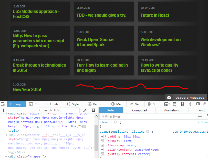
"Red snake" is issue we may deal with flex. It's just because it's not aligned to grid and last item will grow to full available with. So in this case would be better to use grid (if we may not support older browsers).
How to start with flex? I would suggest to play this great educational game flexboxfroggy.com. Later you can go through this article and learn more advanced topics.
Cool game for learning flexbox: flexboxfroggy.com
More resources: https://css-tricks.com/snippets/css/a-guide-to-flexbox/
Table
If we are talking about table, we are talking about table-row and table-cell.
Compatible with every browser, but not every browser is doing recalculation of space similarly.
Tables may be dine for quickly displaying data in "table" without any block elements inside. They will do magic and automatically calculate required space for each column based on texts inside. But, if you want to show more complex tables, responsive tables, ellipsis effect (three dots when no space), then you can pull your hair off when fixing bugs and different behaviors in browsers.
Initally, table was the only element allowing to vertically align content (new techniques like flex and grid allows it too).
It's good to know basics about tables, even though this technique does not have bright future. You can start here: www.w3schools.com/css/css_table.asp
Float
Float is quite old technique, which is there for ages. It starting to be obsolete, because more modern ways of positioning are here, like flex and grid. Those can completely replace float - I would really like idea to deprecate and completely remove float, so that rendering engines might have less work and be less complex. Also developers would have to learn one css feature less :)
Advantage is that it's compatible with nearly everything (Even browsers from early ages).
Learn basics: www.w3schools.com/css/css_float.asp
Keep in mind that when using floating css technique, there are some specifics to keep in mind. If you want "floated" element to take real space, you need to use "clearfix" technique and add clear: both; after floated component.
Disadvantage of css Float is that it doesn't support vertical alignment. Also keep in mind that there are more natural choices like flex and grid.
Which one should we use then ?
Depends on:
browsers you want to target
- need support older - use
tables,floats, orflexbut with proper testing - latest browsers - use
flex,grid
- need support older - use
layout you want to achieve, think about it in responsive way:
- tables with only texts - use
table - responsive tables with ellipsis overflow feature - use
flexfor each row - building main layout - use
grid - positioning elements in one row - use
flex
- tables with only texts - use
Basically if you are building modern internal tool (without need to support old browsers) you can go with css grid and flexbox combination. These are really powerful and you can achieve a lot with really small amount of clever css code.
Flexbox is also something supported in react-native and also other platforms are adopting this technique. This means you can benefit of this knowledge not only in web platform.
Please feel free to leave comments if you have something more to add, or correct. THANKS!